
Sweet Alchemy
(WANAKA · NZ · 2035)
[ BRAND + WEBSITE DESIGN ]
A science-infused brand rooted in softness — where each pastry tells a story, and every detail feels like home.
[ CLIENT ]
sweet alchemy
[ INDUSTRY ]
dessert lab
[ PROJECT ]
Brand & website design
[ PACKAGE ]
Minimal Muse + upgrade
CREDITS.
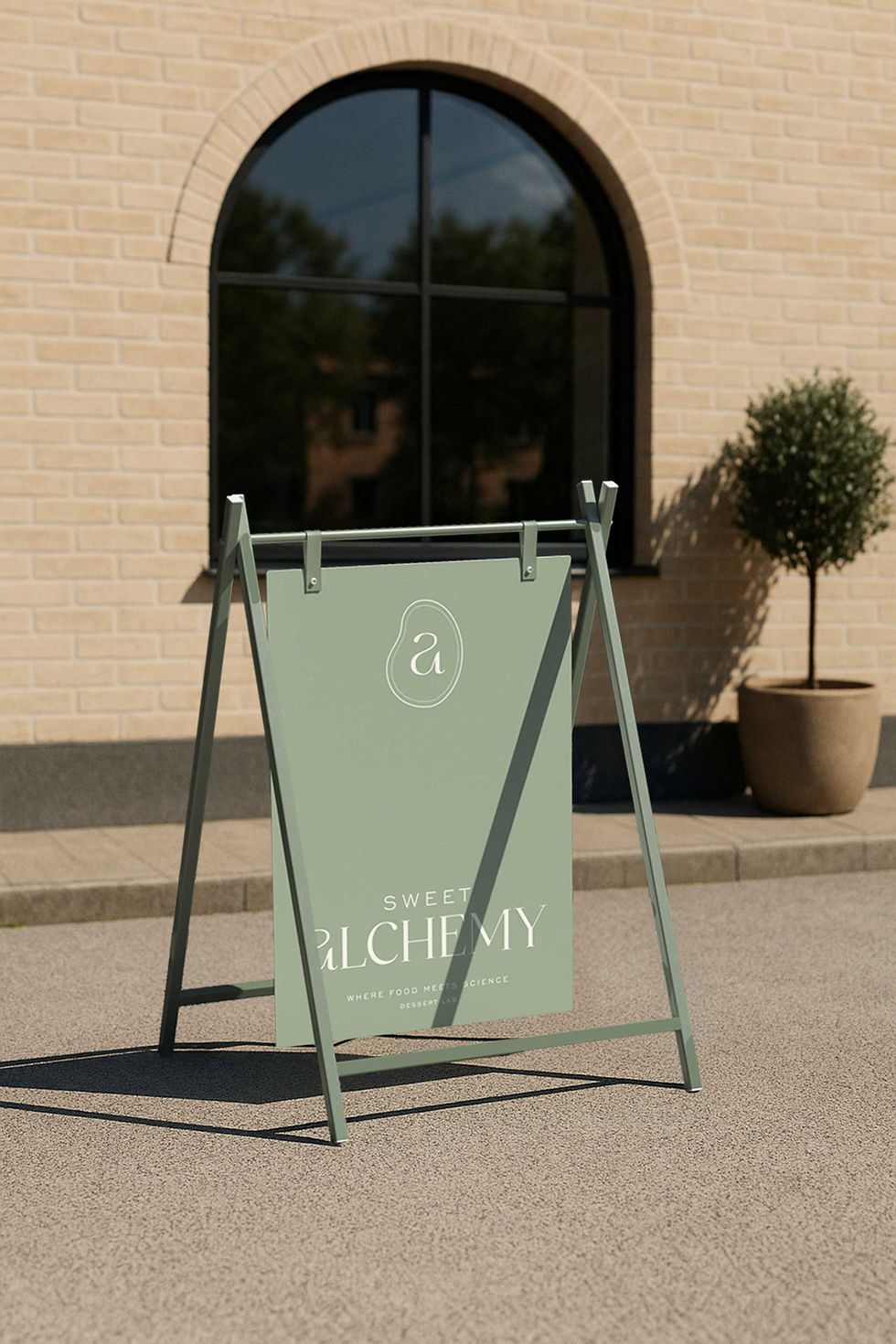
The identity didn’t need to shout. It needed to hold space for all that Adriana was — structured yet soft, precise yet poetic.
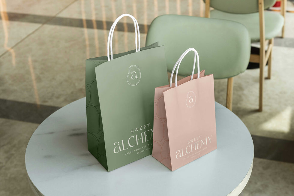
Her logo mark became a blend of her initials — “s + a” — enclosed in a quiet symbol drawn from the cross-section of a wheat kernel. A small ode to both science and simplicity, to structure and softness.


ABOUT.
[ BRAND ]
Logo DESIGN
[ STRATEGY ]
BRAND GUIDELINES
[ COLLATERAL ]
PRINT & DIGITAL
We built her digital space like a warm kitchen — calm, intuitive, and full of care. Every interaction was designed to feel gentle and trustworthy. No clutter, no noise. Just clear pathways to her workshops, her offerings, her story. The site holds everything she is — and invites others into that same softness.


